Starting today, there are customizable graph visuals in almost every section of SparkToro’s reports. Because why the heck should you have to be an Excel visualization expert on top of the 500 other things your boss/team/client expects of you?
Friends, we’ve got your back. When you need to make the case for an investment in a particular social channel you *KNOW* is worth the investment, the Social Networks graph is there to help:
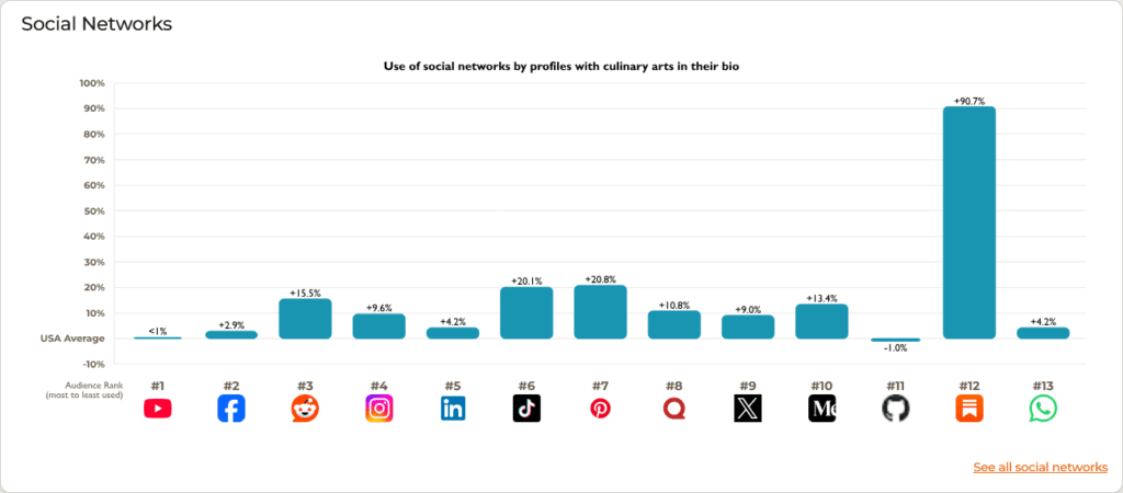
Want to remove Substack, Github, and Whatsapp because they’re not relevant to your pitch?
Just hop over to the Social Networks report and click “Edit Chart:”
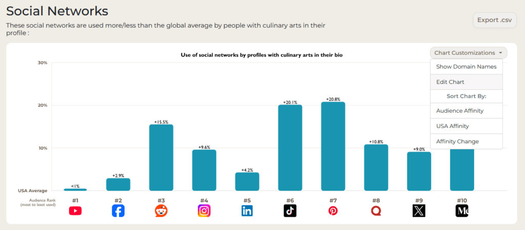
Three quick clicks of the mouse button and Bob’s your uncle (if a British person could confirm I’m using that correctly, that’d be lovely).
Want to show off the YouTube channels with high audience affinity among your ICP?
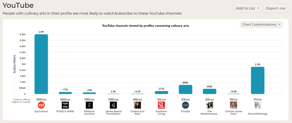
Screenshot away! Or, if you want to make that graph contain *only* the exact channels you want to showcase, simply scroll down, select the channels you want to add, and click the handy “Add to Graph” button.
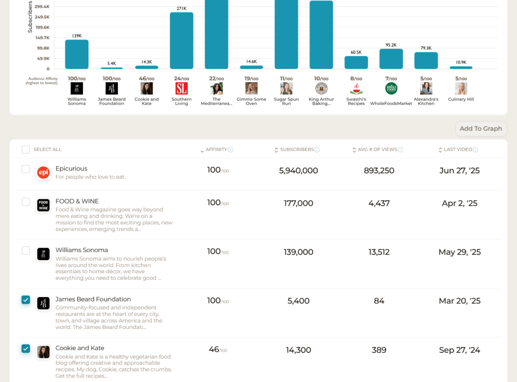
Pretty slick, right?
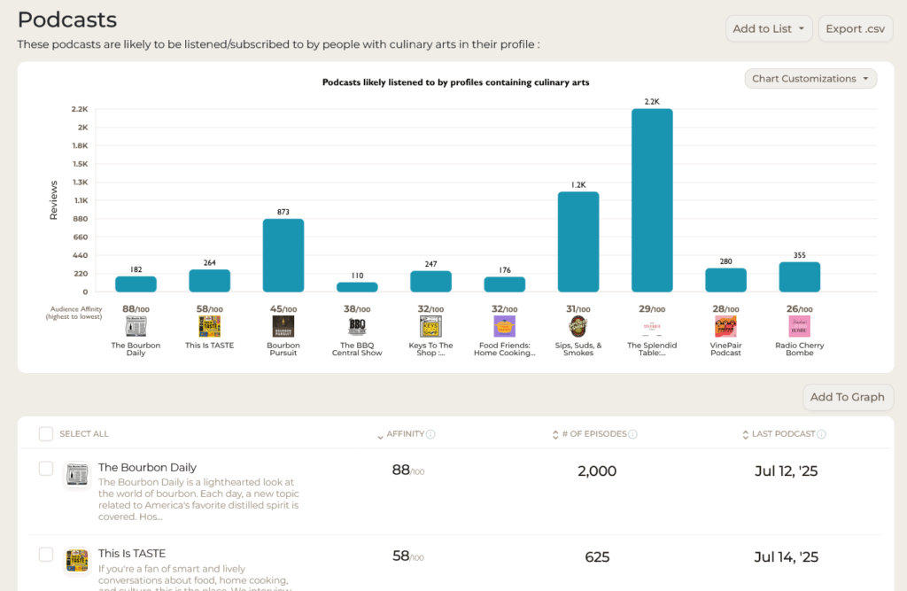
You can use the same trick with podcasts:
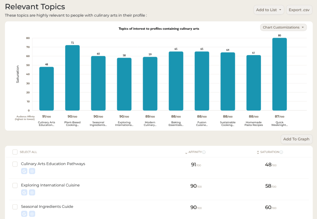
With Topics:
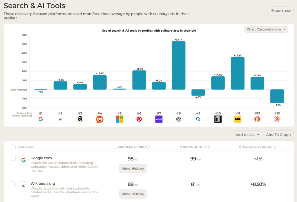
Search & AI Tools:
And more.
This latest update adds a half dozen more graphs to the already visual updates we launched in May. I’m already finding it useful for my copy/paste projects into presentations and reports, and I’m sure you will, too. Enjoy, and drop a line with any feedback or other suggestions you’ve got for us 🤗