I speak a lot. I make a lot of decks. Heck, I’m even on the board of presentation software startup, HaikuDeck.
In the last 3 years, I’ve given nearly 80 unique presentations at 100+ events in the technology and marketing fields. A good percent of the time, I get scores back from the organizers telling me how the audience perceived my talk in relation to other speakers. And, though it feels deeply, uncomfortably arrogant to say, I’m often in the top 1-3.

Based on my experiences of watching the other speakers I lose out to and observing when I get the top scores, I’ve noticed there are two ways to be one of the highest rated presenter at an event in our industry:
- Have more natural talent, sweat-equity experience, and high-quality content than your peers
- Gain and implement knowledge about what tech/marketing audiences appreciate and rate highly better than any other speaker (aka, use what I’m calling “cheats”)
This post is not about how to do the first one; it’s about the second. Make no mistake, these are hacks that leverage psychological and industry-specific biases, not necessarily remarkable strategies that will stand the test of time or work in every field. But, hopefully, sharing them will mean that even those of us who are still developing our talents will raise the bar industry-wide.
Also – when I say “cheats” I don’t mean these are effort-free. In fact, it’s quite the opposite. These will take serious effort and substantive time commitment. But, I believe there’s somewhere between slightly negative and absolutely no value in delivering a subpar presentation at an industry event.
Why? Because if your presentation doesn’t impress, you won’t be invited back, won’t be asked to speak elsewhere, will garner a slightly negative association in the minds of those who attended, and will have wasted a lot of time and expense missing days of work or leisure, traveling, and stressing about building a presentation. Don’t forget that at every event, the audience is comparing you to the other presenters. Sit at a table for lunch and all you’ll hear is “who did you like?” and “what did you think of so-and-so?”
My job in this post is to turn any fear you’ve got into confidence. Because while you’ve read and applied these tips, your fellow speakers probably haven’t. Hence, you can cheat and come out with those awesome speaker ratings 🙂
#1: Don’t Include Advice/Tips/Tactics More than 20% of Your Audience Already Knows
One of the fastest ways to be tuned out by an audience in our field is to present them with information they already know. The level of knowledge will vary by the audience – at Searchlove, SMX Advanced, or Mozcon, that level will be incredibly high and it will take great effort to uncover unique tactics, data, or stories. At less expert-level events, that bar may be lower, but it’s still there and the vast majority of speakers in my experience will underestimate what the crowd’s already learned.
One of the best ways to determine the audience’s knowledge level is to ask the organizers for detail on who attends, where they work, what are their job titles, etc. Using that information, you can look through LinkedIn, find profiles that match, and then see what content they’re seeing/sharing, who they’re following, and what that means about their level of exposure to the points you were planning to make.

Over time, if you speak at a lot of events in a given sector, you’re likely to develop a sixth-sense for what crowds of varying composition want. But, unless you’re confident you’ve got it, use this process to figure out what the audience is likely to already know, and avoid or race through those bits so you can get them to the new stuff.
Caveat: If part of your presentation is to give a setup to the tactics or strategies you’ll be presenting, it’s OK to provide information the crowd may know. It’s also OK to go over people’s heads initially (at least in our world) and then do cleanup during Q+A. Lots of questions about your talk is a good thing, and a presentation that’s perceived as too advanced is almost always better scored by attendees than one they feel is too basic.
#2: Disable the Viewer’s Ability to Read Ahead
Below is a slide taken from A16Z’s recent presentation on US Tech Funding:

While it’s not visually stunning, it is well-laid-out and conveys information important to the points they’re making in the deck. But… I would NEVER show this slide, in this fashion, at a live event.
Why?
Because audiences will read ahead, ignore what you’re saying, and then find their brains frustrated by the speed of your descriptions/explanations lagging the text they’ve just scanned on the screen.
A far better option for live delivery would be to create a separate slide for each point, e.g. for the first phrase “It’s never been cheaper to create software companies,” I’d make a slide like this:

Then I’d do that for each of the others, finding representative visuals for each. At the end, I might have a summary slide like this one to illustrate the balancing of the points I’d just made.
BTW – that’s exactly what the A16Z presentation did!
In an absolute worst-case, where I felt like I didn’t have the time to present or create separate slides, I’d at least make each new point require a separate click, so that I could discuss each individually without having the audience read ahead.

It’s impossible for me to describe how many speakers make this critical error (honestly, it feels like almost everyone fails at this) and loses their audience’s attention in the process. Look for it next time you’re watching a speaker. Even if you take nothing else away from this post except to fix this in your own decks, you’ll probably bring your scores up dramatically and earn considerably more attentive attendees in your next presentation.
#3: Create Tension/Anticipation, Then Resolve It
Great art and great stories create drama. And there’s no reason your presentation can’t take a cue from these forms of sharing human experiences.
To build drama in a talk, simply take the points you’re planning to present and craft a story around them that begins with conflict or a problem. If it’s a major point, let that drama or problem build by piling on, rather than immediately resolving it. For example, let’s say I want to communicate the challenges of getting email marketing right. I might build slides illustrating each of these:
- You send an email to your new subscriber
- But, they don’t think it’s very interesting and barely engage with it before hitting archive
- The next email that comes in gets a quick scan and then is deleted
- On the third boring email they click “report spam”
- Now, even if you fix your emails, your prospect might not ever see another subject line from you
- And, Gmail will have learned to treat your emails with suspicion, lowering their potential reach
- You should probably just abandon civilization and move to this island
- The hermit crabs will know of your shame, but they don’t judge
- Of course, there is another way…
We’ve added a bit of drama, a narrative, a theme (which we might be able to re-use later in the deck), and some creativity to an otherwise dry topic. Plus, we’ve set up our presentation to to deliver resolution via the tactics we’ll show on how to recover from previously poor email marketing.
Virtually any subject you’re discussing can be formatted in this fashion, and when it is, the laptop screens will close, the eyes will be on you, and the heads will start to nod.
#4: Ask the Audience to Engage in Unusual Ways
We’ve all sat in rooms where the speaker says “raise your hand if you…” or “how many of you have…” When those interactions don’t work, the room devolves into a spiral of non-interaction. No one raises a hand, so no one else ventures to raise a hand, and you can almost hear the crickets chirp and the awkwardness increase (doubly so when the speaker retorts “oh come on, no one?” or, worse still “how many of you don’t like to raise your hand?”) <CRINGE>.
Those forms of interaction are tough, even for experienced speakers with terrific skills and content. I struggled early with the hand-raising forms of participation and have mostly given it up (with a few exceptions like the above-noted explanation requests). However, I have seen and used a few other forms that work much better. In particular:
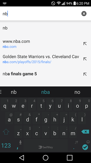
- Asking folks to perform a search query on their phones or laptops in order to illustrate something (e.g. if you started typing “NB” into Google on a mobile device last week, they’d auto-suggest NBA.com’s page for the finals)
- Requesting that the audience shout out their contributions/responses to a relatively straightforward question (e.g. what websites do you think might rank for the query “New York Restaurants”), then showing what I think they’d guess on the next slide
- Suggesting that folks close their eyes and picture a scenario, or get an answer in their head to see if it matches my own (which I then show on the following slide)
These types of less orthodox and less anticipated participation can build much greater engagement between an audience and a speaker, but there’s a cardinal rule to be followed: Ask little of the audience and over-deliver on your end of the bargain. If you violate the rule, request too much from the attendees, and don’t give extraordinary value back, the spiral of non-interaction will flare up.
#5: Share Strong, Verging-on-Controversial Opinions, Then Back Them Up With Evidence
Many presentations I watch provide information without opinion. This works for some folks, but it can be very dry and it’s tough to earn audience engagement. But, when a speaker, even one whose delivery isn’t great and whose material isn’t necessarily up my alley, presents a controversial opinion to start their talk or as a lead-in to a section of the talk, it gets the room’s attention every time. Here’s a few examples:
- Moving off the AWS Cloud and into a private data center can supposedly save you money if you’re spending more than $250K/month. I’ll show why that’s not true anymore through 3 case studies.
- Google says you don’t need to build links, but I think they’re lying and you’ll hurt your marketing if you don’t. I’ll show you why.
- The kind of A/B testing you’re doing on your landing pages is a waste of time. I can prove it. And show you a better way.
- Instagram is going to be a bigger and better B2B marketing platform than Twitter in the next 3 years. Here’s the stats to prove it.
- Content marketing as a practice is going to grow 10X over the next few years, despite all the predictions of content overload.
- There is no tech bubble. Tech investment and valuations are, in fact, low relative to the size of the market and the future potential. In this presentation, I’ll give data to disprove every argument for a tech bubble that I’ve heard. (BTW – this is what the A16Z deck I noted above did)
Sharing data or tactics without an opinion can be boring, even if the material’s interesting or unique. But, when you place your audience in the role of skeptic or of needing to be convinced (or, even, of folks who are on your side but want the evidence to show to those who disagree with them in the future), you naturally generate a buzz of intensity and focus.
(FYI – those examples above are not necessarily points I believe or would make)
#6: Bring Gruesome Death to Every Bullet Point and Stock Photo in Your Slide Deck
I like to use the phrase “Bullet points kill kittens*.” Don’t end lives of adorableness. End presentation drudgery instead.
Here’s an awful slide that was probably designed to fill an audience with resentment while simultaneously luring them to sleep:
My god…. It’s so ugly, my eyes feel like someone rubbed stock photo jalapeno seeds in them.
Now here’s that same slide turned into something memorable and visually compelling:
The difference isn’t subtle, it’s obvious and it’s powerful. The second slide deck grabs attention and shows data in a way that’s likely to generate interest, get people writing notes and snapping photos, and caring about the presentation (although there is a slight error – slides 3 and 10 are copies of each other – even Hubspot gets it wrong sometimes).
I’d be mortified to show that first slide from a stage and, conversely, proud and excited to share the latter deck (though I’d probably make it a little more narrative, controversial, and dramatic to help increase engagement).
Murder the bullet points. Murder not the tiny, fluffy kittens. Leave them alive and do the extra work of breaking your bullets into useful, visual, compelling slides.
#7: Steal the Best Ideas from Around the Web
I steal ideas ALL THE TIME. Most of my presentations are conglomerations of blog posts I’ve read, tweets I’ve seen, shares on LinkedIn, ideas passed around on email, submissions I’ve found on Hacker News or Inbound.org or GrowthHackers or ProductHunt – basically any source I can find that regularly shares good stuff. I take the best and most interesting of what I’ve found online and turn it into amalgams of that content that help tell a story, prove a point, or illustrate a set of tactics.
This works for three reasons:
- In keeping with Cheat #1 on this list, I pick stuff that hasn’t been seen/read by everyone in the industry already.
- I assemble the content in such a way that it helps tell a story or illustrate a point, rather than simply standing on its own.
- I always cite the work’s source, give credit, and provide a link, which usually builds goodwill through the traffic the presentation sends and the shout-out to the person or organization who originated it.

This makes presentation creation massively easier AND it helps bring notoriety to providers of great content/ideas/products (which, thanks to humankind’s natural predilection for reciprocity, usually brings good stuff back to you as a speaker, too). I can take a resource like RKG’s Digital Marketing Report and turn it into a slide with a reference like this one below (granted, not my most beautifully laid-out slide, but it works in the deck):

Now I’ve shared interesting information that most folks in the audience haven’t seen, used data to make an important point in my narrative, given a link to follow-up for reference, sent some traffic to RKG (who richly deserve it), and made my slide-building process 10X easier. That’s a big ol’ honkin’ pile of win-win-win my friends.
#8: Format the Arc of Your Talk Using One of These Four Cheat-tacular Methods
I find that one of the hardest parts of presentation creation is developing the basic outline and structure for how the information will be delivered. Let me cheekily suggest that if you’re struggling with a creative format, you consider one of these four hacks I’ve used many times myself.
A) Narrative story with lessons extracted along the way
e.g. this slide deck about how SEO made me oblivious to a bigger picture, then eventually helped me see it
B) Story that resonates at the start, followed by list of tactics, ending with return to the story
e.g. this presentation walking through Moz’s history, then extracting lessons learned, and returning to the story/experience at the end.
C) Raw sequential list starting and ending with the two strongest elements
e.g. this talk on how we do video content creation and marketing, and why it works for us
D) Emotional or humorous analogy that ties your content together
e.g. this analogy of web marketing to online dating and how the same tactics for success apply
These certainly aren’t the only ways to build a great presentation, but they are, at least for me, powerful crutches with which I can consistently build engaging talks.
#9: Include Exclusively Actionable Advice
In 90%+ of the talks I see, presenters offer a considerable quantity of advice and suggestions that are not actionable – meaning that, as a practitioner of the field they’re speaking about, I can not walk away from the talk and directly do something differently to improve my results. That sucks.
In other arenas, non-actionable information and presentations are fine. TED talks are almost entirely built on non-actionable stuff. You might learn a lot from watching them, but with a few, rare exceptions, they won’t cause you to change the way you do something in your profession. In our fields – marketing and technology – that’s almost always a sign that your presentation will be poorly received. Marketing and tech professionals attend events to learn something new that will make their work better, easier, faster, or more compelling. Fail to deliver that and you’ll see it in the attendee feedback forms.
Here’s an example (apologies to Uberflip, from whom I took these slides – I have no idea whether this presentation was delivered live or what it’s purpose is, so if anyone from that company’s reading this, please don’t take offense!):

Those three slides are at the end of a deck that builds up with promise – it tells a story of how things are changing and how SEO tactics of old may no longer work. But these slides are totally non-actionable. It’s not clear what they mean by “making search engines easy to find you online,” or “creating quality experiences.” These bits of advice are generic, bland, and open to so much interpretation as to be nearly useless.
Contrast that with some slides from a deck I recently delivered (apologies for using my own stuff as an example; I feel like an ass for doing it – it’s hard to find good examples and I’m running over my time allocation for this post) on a very similar topic:

Those four are certainly not the most beautiful or elegant examples of slide design. But, they deliver actionable information by showing what keyword research methodologies used to look like and what they need to add and consider in the modern era of SEO to work better. Instead of saying “create quality experiences,” I’m showing the columns SEO practitioners might add to their keyword research spreadsheets in order to get a better prioritized list, and showing examples of why this is the case in the search results (if you go through the live deck, you’ll see those labeled screenshots).
If you exclude non-actionable advice and double-down on the actionable stuff, I can guarantee better speaker scores and a presentation that better engages your audience. You may also get more critical feedback and disagreement, but these are healthy signs of an audience that’s paying attention and cares!
#10: More Slides Faster > Fewer Slides Slower
Most of us (myself included) probably can’t be Marcus Tandler and deliver hundreds of slides in minutes, spending only a second or two on many of them. But, there are some very powerful reasons to consider increasing the quantity of slides you use, simplifying the message on each slide, and going through them more quickly:
- You don’t have to memorize much – the slides provide the cues for every snippet of information you want to convey.
- Audience engagement will go way up – fast moving visuals alongside your talk will naturally hold attention far better than 30 seconds or a minute on the same visual.
- The slides will almost always work better as a standalone resource – a ton of the value of building and delivering decks comes from folks referencing the presentation after the event (on Slideshare, your website, or from a download link), and many slides making clear, simple points each will usually convey the story of your deck, data, and examples far better than a few visuals with most of the explanation missing (because you delivered it in person)
Granted, this does make you a little less critical to the presentation process, but for some folks, that can be a relief. I find that it makes me a better presenter because I can focus on my presentation of the information, on crafting the energy in the room and in my voice, rather than trying to make sure I cover all the points I wanted to make on each slide and worrying I’ve missed or forgotten something.
My basic suggestion is to do 1 slide per 20-40 seconds of your talk as a baseline (thus, a 30 minute presentation would have 60-90 slides), but then know that few slides will be faster and a few slower (see point #12 below) and balance out accordingly.
#11: Turn the Simple Screenshot Into Your Greatest Ally
Visuals are one of the toughest parts of a slide deck to get right, but our industry has a particular advantage – the relevant screenshot.
For example, say I want to illustrate terrible email marketing. I can just use something like this:

Or if I want to illustrate Google’s growing ability to predict search demand, I can use this:
Or if I want to show off a UX element, I can use this:

Sometimes, I’ll even take screen captures of visuals from around the web and then mark them up to fit my own needs, like this:

Screenshots are engaging, eminently shareable, and great for illustrating a point. They’re also more easily discoverable than a lot of other kinds of visuals you might want to use.
#12: Intentionally Vary Three Things: Speed of Your Slide Sequencing, Volume of Your Voice, and Emotion in Your Delivery
Repetition gets boring fast, especially on a stage. Show one new slide every 30 seconds, stay at the same volume, and use the same emotional intensity throughout a talk and even great information can get lost in the monotony of your delivery. Thankfully, avoiding this fate is simple – design sections of your presentation where you know you want to speak to the audience in hushed tones, when you want to have a big reveal that you reflect on your face and in your voice, when you want to go fast through a bunch of simple slides, and when you want to slow it down to focus on a single concept for a full minute or two.
Build in these variances while you’re making the deck – I’d even recommend including them in the outline (which will make the deck that much easier to create). The monotony will go away, and the presentation’s quality will improve.
#13: Target Your Presentation’s Examples to 2-3 People You Know Will Be in the Audience
Many times, I struggle to find great examples that I want to put in my slides to illustrate a point. I find myself going back to the same topics, niches, and websites I’m already familiar with, and that I’ve used before. But, a powerful tool to add uniqueness and to make the slide deck particularly resonant with attendees is to find folks who say they’re going to be at an event, then use their websites or businesses as examples.
A simple search on Twitter can often do the trick (though you can also look at sponsorship or speaker lists if that doesn’t net results):

Now just take the people you find who are attending, research their profiles, uncover their company/website, and have at it. My only caveat is that you do this primarily for positive or neutral examples, rather than negative ones (though sometimes, a bit of ribbing between speakers or with companies/people you know can work just fine). You don’t want to embarrass folks from the stage, so stick to “here’s a great example of X” or “if they added this, it might work even better” rather than “never do this; it’s terrible.”
These tactics aren’t foolproof, and they’re not all slam-dunks. But, they are tried and tested in our field and you’ll see plenty of great presenters using them to their advantage. Hopefully, by incorporating the ones that make sense to you and that fit with your style, you can upgrade your talks, your scores, and the value you derive from presenting professionally. Break a leg!
* This applies to presentations, not to text in emails or on web pages, where bullet points can make for a more scan-able, pleasurable experience.