SparkToro’s data visualization just got a major upgrade, but rather than tell you about it, I’ll show you:
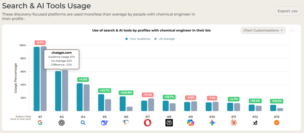
BOOM. Rather than the previous visualization showing only the usage vs. country-level average, the new graph displays exactly the information you’ve been requesting: the percentage of the audience you search for that uses any given search engine and AI tool or social network. I’ve broken it down in 90 short seconds 👇
This upgrade also includes the chart customization features we’ve supported in the past, so that if/when you’re crafting a narrative and need to add additional networks/platforms, or remove ones that you don’t need to show, you can do so with a couple clicks. It’s one of several smaller, but much-requested, quality-of-life improvements we’re adding to SparkToro this week — stay tuned for more soon!
P.S. If you’ve got feedback or want to see this data in other ways, just drop a line in the comments below or in email to support@sparktoro.com.