In our ongoing quest to provide unique, valuable audience intelligence, we’re launching a brand new feature in SparkToro today: Media and Political Insights. You’ll find this data available in the Audience Insights section of any SparkToro search. Any timing of this release with major, upcoming political events is purely coincidental… 😉
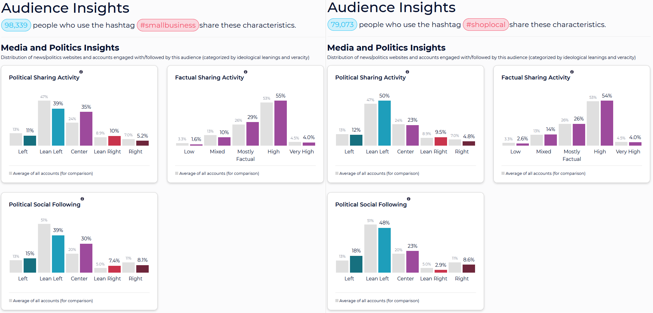
ABOVE: Media and Politics Insights for users of the hashtags #SmallBusiness vs. #ShopLocal
How Is This Data Calculated?
Before you start searching or putting any data into action, it’s crucial to know how it’s sourced. In SparkToro’s case, we:
- Marked every major news, media, and political publication with two labels: bias (left to right) and factual reporting (high to low). We additionally marked their associated social accounts (on Twitter, Instagram, Facebook, LinkedIn, etc) along with the social accounts of the most followed political figures with a bias label (but not factual reporting).
- Determine which of these websites are shared/linked-to/engaged-with and which social accounts are followed by any searched-for audience (calculated at query runtime).
- Give 1 “vote” to each site shared by each member of the audience. If someone in that audience shares one particular website numerous times, it won’t overweight their affinity. Each “sharer” can only “cast” a single vote for a site or social account in our model.
- Tally up the quantity of audience members who’ve shared various sources / followed various accounts, and then display the percentages alongside the average.
- Show three charts from this aggregated data:
1) Political Sharing Activity – which illustrates the distribution of the websites this audience shares. In the example below, profiles whose bio or about section includes the word “CEO” share more from publications marked “lean right” and “center” than the average account, and fewer from those marked “left,” “lean left,” and “right.”
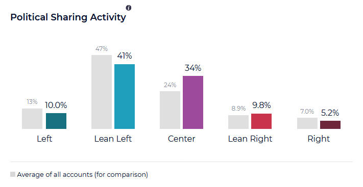
Publications like TechCrunch, Wired, CNBC, Inc, and The Economist are all marked “Center” and all receive a good bit of social sharing from CEOs on Twitter, public Facebook pages, LinkedIn, Pinterest, etc.
2) Political Social Following – which illustrates distribution of accounts followed by the audience on social networks for which we’ve got data. In this case, our CEOs look a bit more balanced with the average profile, with only slight variations in the “Center,” “Lean Right,” and “Lean Left,” categories.

Popular political accounts like the US President’s or former President Obama, members of Congress, well-followed politicians outside the US (like Justin Trudeau or Jacinda Ardern) along with the media publications’ social accounts all fit into this classification.
3) Factual Sharing Activity – which illustrates the veracity of reporting and accuracy of information generally published by a news/media website. In the case of our CEO audience, there’s a bias away from sources marked “Low,” and “Mixed” and more-than-average sharing of content from “Mostly Factual,” and “High” sources.

In general, the “very high” category is reserved (not only by SparkToro’s classification, but by the other four organizations referenced below as well) for fact-based outlets like NPR, the Associated Press, Reuters, Nature, MIT Technology Review, and similar.
How Does SparkToro Determine Media and Political Account Affiliation?
Our methodology for determining political affiliation and bias follows in the footsteps of four well-recognized organizations: Pew Research, AllSides, Ad Fontes Media, and Media Bias/Fact Check. We used criteria similar to that detailed by these groups to hand-mark websites with both “bias” and “factual reporting” labels.
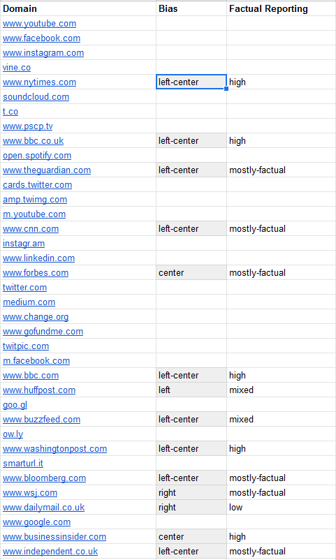
ABOVE: Classification of news, media, and politics websites
The word “bias” gave us pause, because it has such negative associations. However, after reading more on the topics of media bias, we feel there’s not another great way of framing language along a political spectrum. Furthermore, the left/right/center spectrum is generally familiar to marketers, advertisers, entrepreneurs, researchers, and others who use SparkToro. Inventing our own language and shaking up a familiar model would be doing a disservice to our users.
That said, I’m very aware that the classic political spectrum most Western nations employ is reductive and minimizes real ideological variations. We’re not all just “left” or “right” or “center” in our views. But, in researching media bias specifically, I found that the left/right/center spectrum, as poorly as it might describe individually people, isn’t particularly bad at describing the general leanings of most publications.
Long story short: this isn’t my favorite model in the world, but it’s shorthand for a useful, familiar, and applicable-most-of-the-time system. That, and in the several hundred test searches I’ve done over the last week, it consistently matches expectations (an important feature when providing large-scale audience data). Qanon conspiracists share disturbingly low-quality information. Credentialed epidemiologists tend to share very high-quality information. Partisans tend to follow sources from their side (though not nearly with the exclusivity you might expect). And, while some associations surprised me (tech founders are more centrist and left-leaning than I expected, car dealerships tend to be more centrist and high-quality sharers of information than what I’d heard), plenty of stereotypes hold up (authors lean left, folks in construction lean right).

ABOVE: Media and Politics Insights for Rand’s social followers (@randfish on Twitter, @randderuiter on Instagram, rand.fishkin on LinkedIn, etc)
One of the best ways to take this feature for a spin is to try your own website (so long as it receives significant social sharing activity), social account, or a political topic of interest. If those results feel correct to you, that’s a good signal you can trust the data when applying it to audience and fields you might not know well.
What Are Some Applications for This Information?
The genesis for this idea came from two customers of SparkToro, whose work in fields of nonprofit marketing and political advocacy spurred us to make the investment. But those types of organizations are far from alone in finding practical uses for this data. I am certain marketers will find it valuable to:
- Push back against incomplete narratives around an group’s politics. Every audience I’ve searched for has substantive representation across the political spectrum, and I expect this to data to be a powerful way of starting (or ending) conversations about a particular audience’s exclusive affinity for one “side” or another.
- Discover surprises about the degree of affinity between a target customer group a political affiliation, nudging deeper introspection and research (some of which SparkToro can help accomodate by showing, for example, well-followed social accounts, popular websites, hashtags, topics, etc).
- Help sway copywriting, messaging, and positioning to be as inclusive (or divisive) as is comfortable and intended. E.g. Maybe if Coinbase had seen how balanced their audience is across the political spectrum, they’d have reconsidered some recent actions (BTW – it does appear to be swinging to the right, even in just the last week; apologies we don’t yet have over-time tracking, it’s coming soon!).
- On the flipside, I expect there will be cases where this data is used to allay concerns about advocacy work, public support for political causes, and show the tolerance that audiences typically have for viewpoints that might not represent their personal point of view. E.g. Despite Patagonia’s famous reputation for environmentalism, conscious consumerism, and criticism of the Trump administration, they actually have a slightly more-than-average right-leaning audience.
All that said, if I’ve learned anything over the last 6 months of SparkToro’s existence as a product, it’s that our users ALWAYS surprise me with their creative applications for audience data. I think that’s my favorite part of releasing new features—seeing just how many incredible uses people find for the information. I’m excited for that today, and of course, I’d love to hear from you if you are applying these insights in interesting and valuable ways.
One final note: if you’re a longtime SparkToro user, you’ll see that we’ve changed the layout of the Audience Insights tab today, organizing the various data elements into groups based on function.

Hopefully, this new layout will help you more easily get to exactly the data that matters to your audience research efforts, and if you’ve got any feedback, we’re all ears: support at sparktoro dot com.
Casey and I are passionate about continuing to provide more value inside SparkToro every month. Our database of public web+social profiles grows every day, and we have a long list of more audience intelligence features coming in the months ahead. Stay tuned, and please let us know any questions you’ve got in the comments below.